Download Source Files
- Source files for this tutorial are available to Premium members.
Get a Premium Membership
Roy Lichtenstein’s pop art comic book images are as familiar now as they were in the 1960′s. They demonstrate a stylized way of presenting a photo of yourself or anything else you can think of. Using Illustrator’s custom brushes and swatches, we’ll be recreating a Lichtenstein style of effect in this intermediate level tutorial.
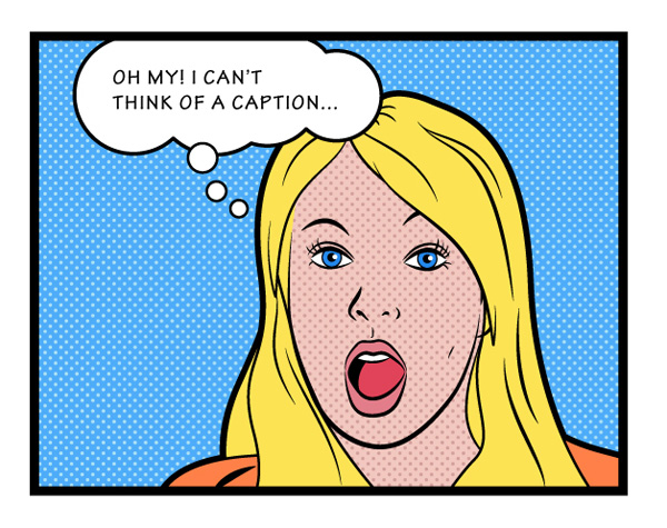
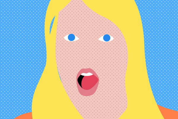
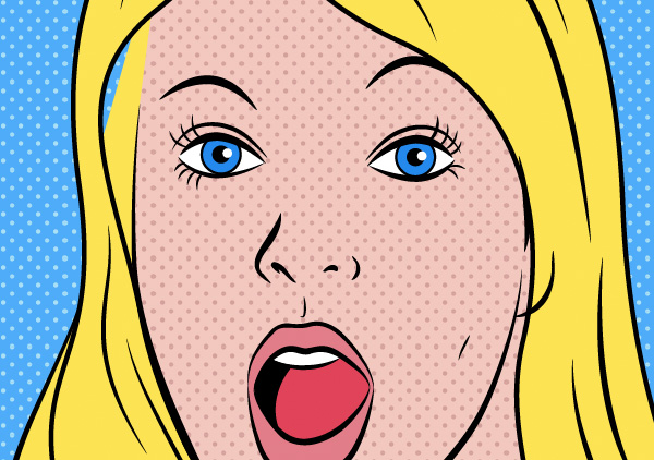
Final Image Preview
The image below is what we’ll be working towards.
Step 1
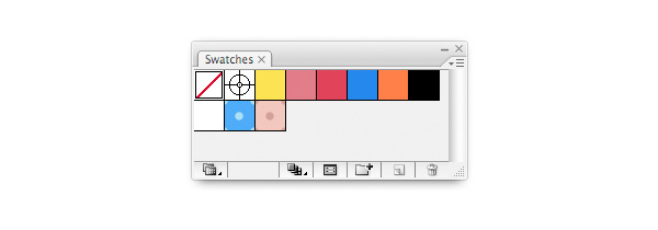
These comic book images recreated a printing process using what became known as Ben-day dots. Equally spaced and sized dots in the four printing colors were layered to produce other shades. In any case, the effect was best put to use with limited colors so we’re going to put together a palette of only seven swatches plus black and white.
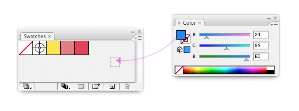
Drag the following colors (here shown in hex-values) from the color panel into the Swatches panel.
- #FCE354 – Hair
- #E27D89 – Lips
- #E04359 – Tongue
- #2489ED – Eyes
- #FF8048 – Blouse
- #000000 – Black
- #FFFFFF – White
Double-click on the swatches once in the Swatches panel and name them accordingly.
Step 2
We need to complete our palette by adding the two Ben-day dots patterns. These will fill the background and the skin. Illustrator offers hundreds of patterns, but building your own gives you huge freedom. These simple dots are a perfect way to learn.
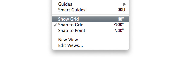
Begin by selecting both View > Show Grid and View > Snap to Grid from the top menu. These options will make it easier to be precise when creating our patterns.
Step 3
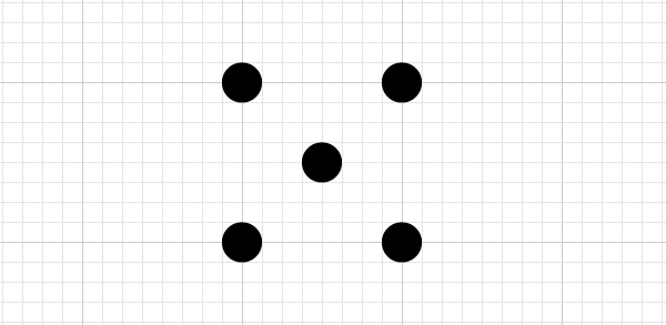
Using the Ellipse Tool, draw five perfect circles of equal sizes. Then position them on your grid, as shown below (with the Snap to Grid turned on you should manage this with your eyes closed!)
Step 4
These dots form the basis for our pattern, but to ensure that they tessellate (tile) properly, we need to define the edges of what will become the swatch.
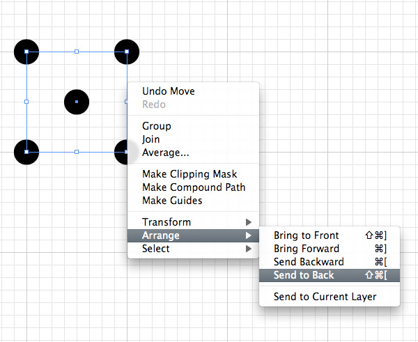
Draw a square following the darker line of the grid, intersecting the center of your four outer circles. Ensure the square has no fill color and no stroke color, then right-click it, and send it to the back of your tile objects.
Illustrator will recognize this object as the area to be repeated, anything which falls outside (such as three quarters of each of the outer circles) will not be included in the pattern.
Step 5
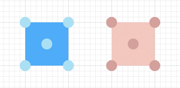
Select your transparent square, copy, and then paste it in place (Edit > Copy, Edit > Paste in Front). Give this copy a color of #4EACF9 and then color the dots #ABE0F4. Duplicate the whole thing, color it #F2C8BF, and color the dots #D3A09B. Select the objects of each one and group them (Object > Group), making two separate groups.
Note: These colors don’t represent true CMYK printing values, but create a nice effect so we’ll just put that down to artistic license.
Step 6
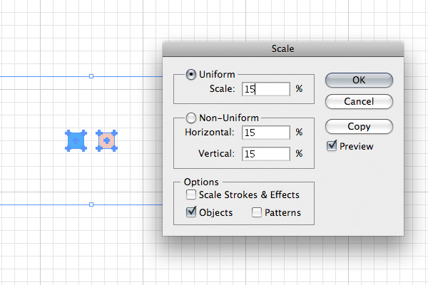
Before we add these two groups of objects to the Swatches panel, we’ll scale them a little. Select them both and choose Objects > Transform > Scale from the top menu. Give them a uniform value of 15% and click OK.
Step 7
Just as you dragged colors, you can now drag each of the tile groups into the Swatches panel instantly turning them into pattern swatches. Double click each one and assign them names of ‘Background’ and ‘Skin’. I’ll let you work out which one’s which.
Go to View in the top menu, turn off Snap to Grid, and select Hide Grid to return to the original drawing settings.
Step 8
Anything can be drawn to emulate Lichtenstein’s comic book style, though typically his were scenes of domesticity and consumerism. An image of a surprised woman could represent a troubled business woman or shocked mother. So, I chose this image from dreamstime.com.

Step 9
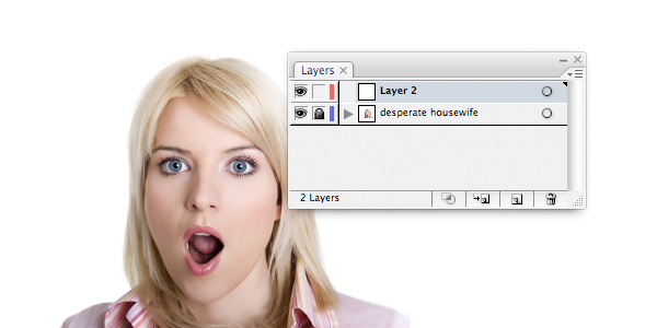
Open your image in Illustrator, lock the layer it’s on, then make a new layer on which to begin your drawing.
Step 10
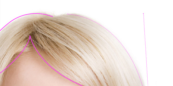
Using the Pen Tool, draw basic areas to form the colored parts of the drawing. While doing this, you may find it easier to draw shapes with just a brightly colored stroke to avoid hiding parts of the photo while you’re using them. You probably have your own preferred method of working here.
Use smooth rounded lines and don’t be afraid to exaggerate certain features: like the mouth, wavy hair, wide surprised eyes. We’re creating a comic image here after all.
Step 11
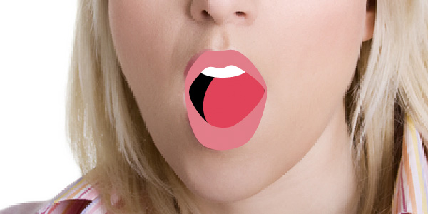
See how the mouth is built from just four simple shapes. The teeth are absurdly rounded as is the tongue, but it gives us the effect we want.
Step 12
Using the swatches, fill each of the main shapes you’ve drawn. The labels given to the swatches should make this a simple task; just select the object you wish to fill, and click on your swatch. She looks kind of funny so far, but we’ll keep working on it.
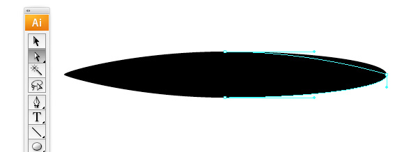
Step 13
We need a brush to give us the black marker pen strokes which define our images features. Draw an Ellipse on your artboard. Then using the Direct Selection Tool, reduce the handle size on either end. This gives you a pointy ellipse which we’ll use as a brush.
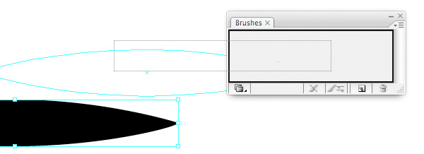
Step 14
Drag your form into the Brushes panel. In the dialogue that appears select New Art Brush and click OK. In the following Art Brush Options dialogue give this brush a name if you wish and click OK. The Illustrator default values are fine for our needs here.
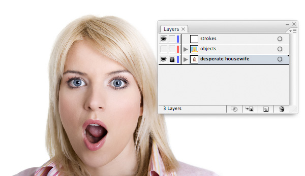
Step 15
We now have a layer for our image and a layer for our filled objects. Make the objects layer invisible and create a third one, which we’ll be drawing our black strokes with.
Step 16
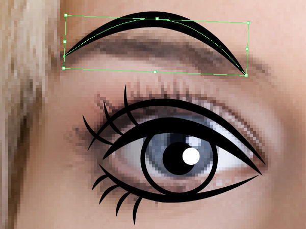
Using the Pen Tool draw a series of curves for each of the elements of our subject’s face. Once drawn, keep the vector selected and choose your custom brush from the Brushes panel. In the Stroke panel change the weight of each line depending on the emphasis needed (for example, the eyelid is a little heavier than the line under the eye, and the eyebrow is heavier still).
It doesn’t take a great amount of detail to create what looks like a convincing eye. It does, however, take a bit of practice. You can get away with making certain aspects larger, more pronounced – such as the eyebrow here, but be careful not to make it too Mickey Mouse.
As you can see, I also lowered the eye slightly to improve the overall look of the face. These decisions are entirely up to your artistic discretion.
Step 17
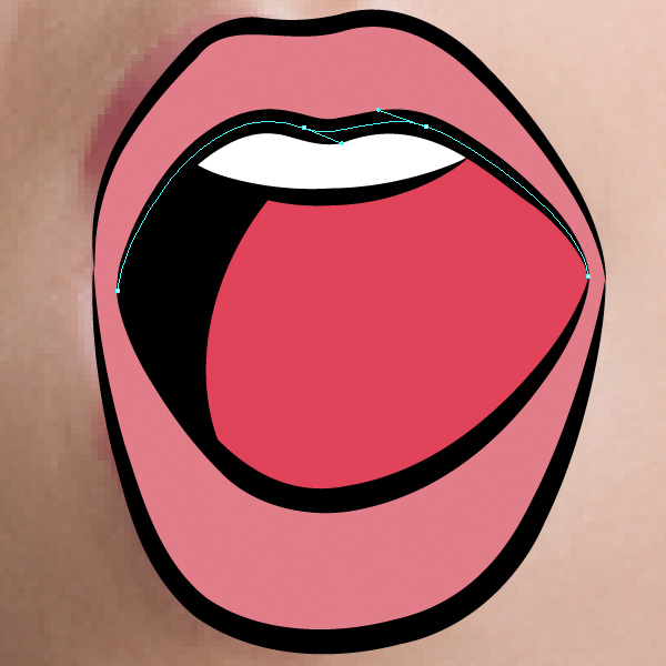
I’d exaggerated the shape of the mouth so much that tracing the photo was no longer appropriate. Make a copy of the mouth and paste it onto your Strokes layer. In the same way as you did around the eyes, draw a series of curved vectors using the Pen Tool, and alter the line to your custom made brush. Just five strokes around the mouth will be enough to make it stand out.
Step 18
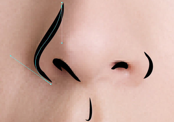
Again with her nose, you’ll need only a couple of strokes to finish it off, as too many lines will add years to her.
Step 19
Continue to outline your objects, some with a normal stroke, some with your custom brush, until you’re satisfied with the result. Make your Objects layer visible and see how it all looks together.
Now you may have to start to alter the order in which objects and strokes are organized; send some strokes back and some objects forward depending on how it looks. Don’t worry too much about keeping things in the correct layers either.
Step 20
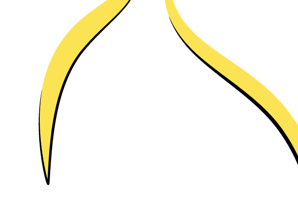
Build some extra hair strands out of solid shapes and black strokes to finish layering her hair. Place them on top of the whole drawing so far.
Step 21
Select everything you’ve drawn except for the blue background rectangle, make a copy (Edit > Copy) and paste in place (Edit > Paste in Front). Select the Combine tool in the Pathfinder panel to join it all together and then click Expand.
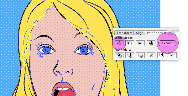
Step 22
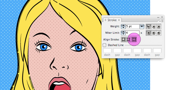
Give this object a nice heavy stroke and align the stroke to the outside of the vector, see image below. This gives our character a solid outline.
Step 23
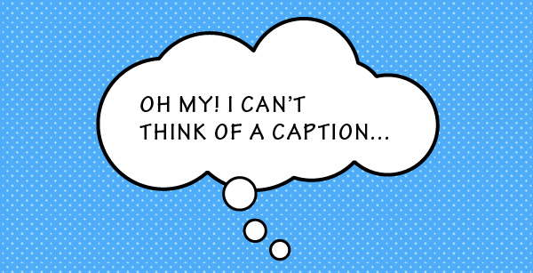
Build a caption bubble out of a series of ellipses by combining them together with the Pathfinder tool. Give your main bubble a heavier stroke than the smaller ones. Also, use a hand-written style font for the caption. I’ve used Tekton Pro, a font from Adobe, but you can use your discretion as to the font that fits your illustration best.
Group the caption objects (Object > Group) and place them somewhere on your drawing, even overlapping the edges, and the character.
Step 24
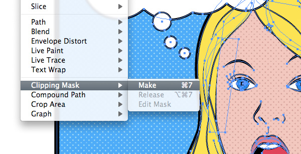
To finish the comic book look, you’ll need to tidy the image up. Select everything (assuming your photo layer is still locked) and group together (Edit > Group). Draw a rectangle where you wish the edges of the illustration to be and then copy it to the clipboard (Edit > Copy).
Select the group of objects and your new rectangle and go to Object > Clipping Mask > Make.
Now paste your copied rectangle back onto the artboard (Edit > Paste in Front) and give it a heavy black stroke of uniform thickness. You have now masked your drawing and given it a comic book style frame.
Conclusion
You’ve completed your Lichtenstein style illustration! In doing so, I hope you’ve become familiar with making your own patterns and have brushed up on your vector drawing skills too. The final image is below.
Appendix
Scaling patterns is an issue which needs to be mentioned before we wrap up. By scaling an object filled with a pattern you’ll by default increase the surface area of the object, but the pattern will remain at the same scale (in our case, we’d get more dots).
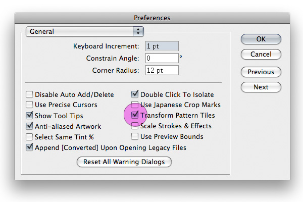
By going to Illustrator > Preferences > General you can change this should you wish to. You can turn on Transform Pattern Tiles, as shown below. You’ll now proportionally scale your pattern whenever you scale your object.
Alternatively, you could go to Object > Expand and turn your pattern into individual vectors, though in doing so you’d be sacrificing the flexibility Illustrator’s patterns offer you.